Thursday, September 2, 2010

Week 6 last blog for semester 2-Barbara Kruger


American conceptual/pop artistBarbara Kruger is internationally renowned for her signature black, white and red poster-style works of art that convey in-your-face messages on women's rights and issues of power. Coming out of the magazine publishing industry, Kruger knows precisely how to capture the viewer's attention with her bold and witty photomurals displayed on billboards, bus stops and public transportation as well as in major museums and galleries wordwide. She has edited books on cultural theory, including Remaking History for the Dia Foundation, and has published articles in the New York Times, Artforum, and other periodicals. Monographs on her work include Love for Sale, We Won't Play Nature to Your Culture and others. She is represented in New York by Mary Boone Gallery. A major exhibition of her work will be presented at the Museum of Contemporary Art in Los Angeles in fall 1999, and at the Whitney Museum in New York in 2000.

Research Kruger's work to find an example from the 1970s or 1980s to compare with a more recent work. How has Kruger's work changed with the developments in contemporary visual arts? Describe a recent work that moves away from the 'poster' type work of her early career.

Barbara Krugers artwork is really quite bold and powerful. It grabs your attention and almost slaps you across the face with its bold messages. One that really caught my eye was 'We don't need another hero'
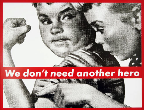
To me, the work speaks about how everyone grows up with grand dreams of some kind, but no one really achieves them, often because they are impossible. I wanted to grow up to be a transformer, but despite my best efforts I can still only turn one of my hands into a side mirror, and what use is that really. It also looks as if the boy is trying to show how tough he is to the girl, playing on sexual stereotypes about how men are stronger and women need them to look after them.

This new work of Krugers also caught my eye, "Untitled/Chess Board"


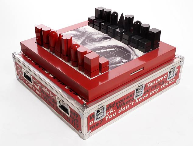
It shows her progression from flat 2d posters to something more 3d and contemporary art like, incorporating scultpure while still maintaining her bold black white and red distinctive style. The work speaks to me about how we're all just pawns in some grandscheme of the rich and powerful, almost tieing in to the whole illuminati grand scheme conspiracy theory, with the phrase "you have no choice" particularly catching my eye, as if to say "you're already someones pawn, and you're stuck in it, in this society, you cant change, you cant get out, you have no choice".
Find 2-3 works by Kruger to add to your blog.


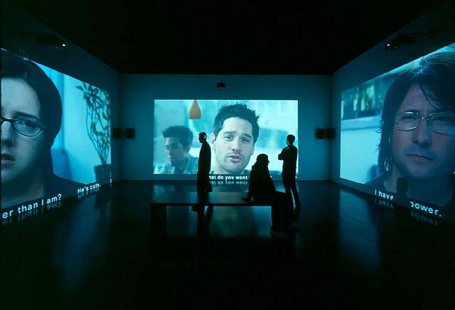
How does the audience experience a more spatial, installation art work compared with a poster?

I think the audience experiences a spatial or installation art work differently from a poster in that the audience becomes part of the work. When you stand and look at a poster, its nice to look at, but thats just it, you just look at it. Something spatial that you can move and walk through, or even interact with, engages the audience more and helps convey the artists meaning.

What elements does Kruger use in her work to create a strong impact?
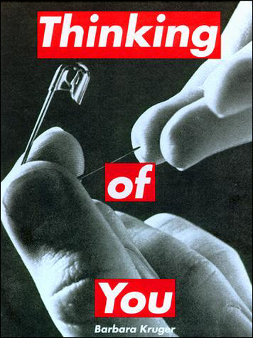
Contrasting black and white images with bold red and white lettering. Quite stattic almost serene photography that often seems to contrast with the text also seems to be an apparent element, where the picture by itself might seem somewhat harmless and fine, as soon as you combine it with the text it becomes something completely different, and the meaning changes, which I think is her strongest element.

Comment on the development of her work over the last 30 years.

It's quite impressive the way her work has changed and yet not changed. Her work has progressed from simple posters into full spatial installations with video and audio, but her distinctive style is still there, showing you it is definately a Kruger work. Personally I think the fact she has stuck with such a distinctive style all this way is impressive, others might call it lazy, but I think theres a fineline between not improving and not fixing what isnt broke.

Comment on the examples that you find on other students blogs.

Week 5 - Kehinde Wiley


Week 5 - Kehinde Wiley


Kahinde Wiley is a Gay American based painter born in Los Angeles, who has an international reputation living between Pe King and Brooklyn.


Last weeks ALVC class focused on the Post Modern them "INTERTEXTUALITY", re-read Extract 1
The death of the author on page 44 of your ALVC books and respond to the oil paintings of Kehinde Wiley. How do we make sense of his Kehinde's work? Identify intertextuality in Kehinde's work?

Kehinde's work relates to this weeks Post Modern theme "PLURALISM" re-read page 50 and discuss how the work relates to this theme?

Kehinde's work raises questions around social/cultural hierarchies , colonisation, globalisation, stereotypes and the politics which govern a western worldview.

Information on specific paintings was difficult to obtain however Matt has the info for the last 2 paintings.

3. Kehinde Wiley Count Potocki, 2008 oil on canvas, 274.3 x 274.3cm

4. Kehinde Wiley Support Army and Look after People, 2007 oil on canvas, 258.4 x 227.3cm

thursday, august 5, 2010


Kehinde Wiley's work is really interesting, on one side they look like something you wouldn't see out of place on a rap album cover or in 50 cents new music video, but on the otherhand the floral like patterns give them a very old antique feel (also, I'm pretty sure my Nana's curtains are in that exact pattern :P)

The paintings speak heavily of pluralism, what with the depiction of black african male stereotypes, sporting gang colours and bandanas, however that in itself is a good example of the death of the author. When I look at the first work I see some 'thug gangsta' pulling gangsigns and sporting gang colours, but i've never actually met someone quite that 'gangsta' so they only reason I must be perceiving it as this is the stereotype i've learnt from media and tv.

It is said that during modernity, middle class white culure was more high or civilised, so depicting black males as the main counterparts of these pictures could be considered very post-modern. Although that said, im sitting here worrying that if I say that I dont like these paintings, would that be interpreted as racism? God I hate political correctness.

The pictures depicting strong male figures riding valiant horses could be seen as quite phallic in origin, what with the whole stereotypical rumour of black males been qutie 'well hung' and horses beings the stereotypical large penis animal most people think of (even though a barnacles is WAY longer in terms of body length for those of you playing at home). It's also like something you'd see out of a war painting, especially painting number 2 which reminded me of the famous painting of George Washington next to a regal looking white horse, which I suppose is another example of intertextuality. These pictures seem to be riddled with intertextuality, especially the references to my nanas curtains, the patterns are seriously uncanny, focussing on the background patterns alone is bringing back a rush of childhood memories, which is rather unnerving.

Sunday, August 29, 2010

Week 4- Anish Kapoor


Week 4- Anish Kapoor


Celebrated for his gigantic, stainless steel 'Cloud Gate' sculpture in Chicago’s Millennium Park, Anish Kapoor is changing the cultural environment with his public works.

1.Research Kapoor's work in order to discuss the ideas behind 3 quite different works from countries outside New Zealand.

'Cloud Gate' is a a piece located in the AT&T Plaza in Millennium park in Chicago. It is a massive highly polished steel structure that reflects the surrounding city scape and is shaped like a bean. The work was inspired by the form of the element mercury in its liquid form (see image). The work speaks of an almost seperate reality in the middle of an urban thoroughfare.

'Svayambh' is a structure made of Vaseline, paint and wax which gives the impression is has flowed on train tracks into the other room of the gallery at the Musée des Beaux-Arts in Nantes and Munich's Haus der Kunst. The piece has a start contrast to the pure white walls of the gallery, and is quite messy, almost like a stab at the pretentious cleanliness of art galleries.

'Marsyas' is a giant sculpture resembling a big red double ended trumpet that was made for the Turbine Hall. The structure was made so that the entire sculpture cannot be viewed in its entirety from any one position, so the sculpture was made to be experienced as many "discrete encounters". The work is named after Marsyas the satyr from Greek Mythology who was flayed alive by the god Apollo.

2.Discuss the large scale site specific work that has been installed on a private site in New Zealand.

“I am interested in sculpture that manipulates the viewer into a specific relationship with both space and time.” –Anish Kapoor, Tate Magazine, July 2007
Anish Kapoor's "The Farm" is located right here in New Zealand in the Kaipara Bay just north of Auckland. It is designed to reflect and distort the images of the surrounding landscape and to withstand the high winds that blow in from the Tasman Sea. It is made of red polyester fabric and steel. It is shaped quite similarly in my opinion to his work 'Marsyas', but almost looking more rural or wild then its predesessor.

3. Where is the Kapoor's work in New Zealand? What are its form and materials? What are the ideas behind the work?

Most of the answers for this part can be found under question 2. The ideas behind the work are about the viewers perception of space, time and reality. It is designed to make the viewer question their perspectives of these.

4. Comment on which work by Kapoor is your favourite, and why.
I'm going to have to say the cloud gate is my favourite, its so visually appealing, I really want to visit it to run underneath it and see how distorted everything looks in the reflections. I've always loved houses of mirrors and mazes and stuff, so something about it just intrigues me.

Youtube has some excellent footage on Kapoor-take a look at Anish Kapoor at the Royal Academy!!

sunday, august 1, 2010

Sunday, August 22, 2010

Week 3 - The Walters Prize 2010


a) Saskia Leek
b) Fiona Connor
c) Dan Arps
d) Alex Monteith


This week we will be visiting the Auckland Art Gallery to view, research and write about the artists selected for the Walters Prize 2010. Discuss the work in the gallery with your tutors and other students and answer the following questions.

1. What is the background to the Walters Prize?

The Walters Prize is highly regarded as the most prestigious award in New Zealand contemporary art. It is awarded biennially and is named after artist Gordon Walters. The award comes with the chance to travel to New York to exhibit their work at the famous Saatchi and Saatchi gallery, aswell as $50,00.

2. List the 4 selected artists for 2010 and briefly describe their work.
Saskia Leek's 'Yellow is the Putty of the World' is an oil painting depicting what appears to be a house on canvas.
Fiona Connor's 'Something Transparent (please go round the back)' is an installation set up using plastic wood and acrylic. It is an eerie display almost like a maze of plastic and has a ghostlike feel to it.
Dan Arps's 'Explaining Things' is a series of works using mixed media including newspapers. On a side note, for extra information I watched his interview on the art gallery website, and not only was it unhelpful, this guy was seriously boring.
Alex Monteith's 'Passing Manoeuvre with Two Motorcycles and 584 Vehicles for Two-Channel video' is quite aptly and slightly unoriginally named, as it features as its namesake implies, 2 motorscyclists lane splitting during gridlock public holiday traffic and passing 584 vehicles by traveling between rows at speed. It has both video and performance elements.

3. Who are the jury members for 2010?
According to the Auckland Art Gallery website, the jurors are:

Jon Bywater - Programme Leader, Critical Studies at Elam School of Fine Art, The University of Auckland.
Rhana Devenport - Director, Govett-Brewster Art Gallery, New Plymouth
Leonhard Emmerling - Visual Arts Adviser, Goethe Institute, Munich, Germany, former Director, ST PAUL St, AUT University
Kate Montgomery - Director, Physics Room, Christchurch

( http://www.aucklandartgallery.com/whats-on/events/2010/july/the-walters-prize-2010 )


4. Who is the judge for 2010 and what is his position in the art world?
The judge for the 2010 Walters Prize is the highly respected former-director of London's Tate Modern, Vicente Todoli. Todoli's destinguished career includes being the artistic director for The Valencia Institute for Modern Art aswell as successfully curating renowned exhibitions of contemporary artists internationally.
5. Who would you nominate for this years Walter's Prize, and why? Substantiate
you answer by outlining the strengths of the artists work. How does this relate
to your interests in art? What aspect of their work is successful in your opinion,
in terms of ideas, materials and/or installation of the work?
Personally I would nominate Alex Monteiths's 'Passing Manoeuvre with Two Motorcycles and 584 Vehicles for Two-Channel video' for the award this year as I believe hers to be the most original and successful of the entries. I really enjoyed watching her interview also as she was by far the most entertaining when describing her work, not trying to make up bullshit to justify secret meanings behind her work anywhere near as much as other contestants (I wonder if its too late to enquire whether we're meant to keep language in these blogs PG? bit late I guess). Her work shows 2 masked nameless motorcyclists riding cycles with the liscence plates blanked out 'lane splitting' during Aucklands famous public holiday gridlock traffic. Having driven through gridlock traffic only to see some smug motorcyclist or scooterist whizzing down the middle of the lanes of traffic is not only infuriating, its an experience almost every Aucklander can relate to. It's like the big bloke cutting infront of you in line at McDonalds, it pisses you off, but the bloke has more muscles then he does brain cells, so theres not much you can do about it, only with cars and motorcycles, by the time you realise theres a cyclist lane splitting, its too late to swing your door out for a last minute clothesline (not that I've ever done that, as my lawyers would have me write here).
As you only really "Get" art when you can relate to it, I believe this is a very strong piece. It's also a very daring performance piece as the danger to these cyclists is very real, with the chance of hitting a car or last-minute-swung-out car door is very high. The riders names have no been divulged, I assume as to avoid prosecution for both riders and artist, which I think is also another strong point, the secretive element behind it all.

6. Comment on other blogs from your ALVC group to agree or disagree with other people,always backing up your answer with clearly stated reasons.

Monday, August 2, 2010

Week 2 - Hussein Chalayan

Hussein Chalayan is an artist and designer, working in film, dress and installation art. Research Chalayan’s work, and then consider these questions in some thoughtful reflective writing.

1. Chalayan’s works in clothing, like Afterwords (2000) andBurka (1996) , are often challenging to both the viewer and the wearer. What are your personal responses to these works? AreAfterwords and Burka fashion, or are they art? What is the difference?

Not all clothing is fashion, so what makes fashion fashion?


I must be missing something here, I don't see the 'challenge' in Afterwords. It just seems like the sorta fashion item you'd see on a catwalk. Personally I don't really get nor desire to understand much about fashion, being a male who's dress sense barely outdoes that of a snazzy caveman, it's not really my cup of tea, however looking at Afterwords I don't see anything but a fashion piece. Burka on the otherhand speaks to me almost about the contrast and progression of fashion throughout the ages, or that of western civilisation and eastern civilisation; the scantily clad bikini wearers of california contrasted with the full body gowns of eastern countries. It almost seems like the contemporary art of the fashion world, however the line between fashion and art isnt so easy to distinguish.


Hussein Chalayan, Burka, 1996


Hussein Chalayan, Afterwords, 2000

2. Chalayan has strong links to industry. Pieces like The Level Tunnel (2006) and Repose (2006) are made in collaboration with, and paid for by, commercial business; in these cases, a vodka company and a crystal manufacturer. How does this impact on the nature of Chalayan’s work? Does the meaning of art change when it is used to sell products? Is it still art?


Just like you could say there are artistic elements in fashion, I believe it would be fair to say that you can have artistic elements in advertising. While some would say it detracts from the meaning of the piece that it was paid for and collaborated with by big companies, I think that ultimately that is better then the piece not having the funds and ending up not getting the message across. To me its like someone handing you a new fancy paintbrush and saying in exchange, make me a picture. I think to an extent however much art can be used to advertise products, I don't want to see it head in a direction that TV and Movies similarly have, in that to be able to finance the final outcome, product placement has been littered around the piece itself. Could you imagine the Mona Lisa holding a can of coke?

3. Chalayan’s film Absent Presence screened at the 2005 Venice Biennale. It features the process of caring for worn clothes, and retrieving and analysing the traces of the wearer, in the form of DNA. This work has been influenced by many different art movements; can you think of some, and in what ways they might have inspired Chalayan’s approach?


Hussein Chalayan, still from Absent Presence, 2005 (motion picture)

The first image that came to my mind from "caring for worn clothes, and retrieving and analysing the traces of the wearer, in the form of DNA" was some form of CSI:Clothes, that the mistreatment and abandonment of these previously loved clothes was something of a crime and the previous owners are being tracked down forensic style. Even the image seems like it, with the clothes lieing on an operating table and someone peering in anxiously, so you could almost say her work had been influenced by the recent pop culture boom in shows such as CSI and Law and Order, with forensic work and crimes and the such. However in terms of art movements, you could say its almost like a surrealist work, the idea of clothes being treated like people in an ECU seems like something I would dream of, something crazy and nonsensical from the back of my mind.


4. Many of Chalayan’s pieces are physically designed and constructed by someone else; for example, sculptor Lone Sigurdsson made some works from Chalayan’s Echoform (1999) and Before Minus Now (2000) fashion ranges. In fashion design this is standard practice, but in art it remains unexpected. Work by artists such as Jackson Pollock hold their value in the fact that he personally made the painting. Contrastingly, Andy Warhol’s pop art was largely produced in a New York collective called The Factory, and many of his silk-screened works were produced by assistants. Contemporarily, Damien Hirst doesn’t personally build his vitrines or preserve the sharks himself. So when and why is it important that the artist personally made the piece?


I personally think there is an importance in the artist actually making the work themselves, its one thing to create an idea, but not actually creating the piece yourself doesn't seem right in my mind. Art to me is an expression, and its not the same if someone else is expressing it for you. Especially in the cases of Hirst where even though often the only contribution to a piece he has is signing his name to it, and all the credit of the piece goes to him because "he came up with the concept" I believe is compelete bullshit. Personally I think the artist is the one that creates the work, the person who thought of the idea has almost nothing to do with it, more like a starting point for the real artist.

wednesday, july 7, 2010

Saturday, July 24, 2010

Nathalie Djurberg's 'Claymations'.

Swedish artist Nathalie Djurberg's intricately constructed claymation films are both terrifyingly
disturbing and artlessly sweet.

The new works created for the Venice Biennale explore a surrealistic Garden of Eden in which all that is natural goes awry.

She exposes the innate fear of what is not understood and confronts viewers with the complexity of emotions.

Nathalie Djurberg was awarded the silver lion for a promising young artist at the Venice
Art Biennale 09.
(http://www.designboom.com/weblog/cat/10/view/6886/nathalie-djurberg)

Research Djurberg's work in order to answer the following questions;

1. What do you understand by the word 'claymation'?

Claymation is the term given to animation made through the use of clay models. These models often have interchangeable parts such as different arms/eyes/ears etc to depict different actions or emotions. The models are repositioned for every frame of a shot, so that when all the frames are compiled together and played as a film, it shows movement. It is similar in nature to 3D animation.

2. What is meant by the term 'surrealistic Garden of Eden'? and 'all that is natural goes awry'?

The term 'surrealistic Garden of Eden' implies the land is a paradise, as in the bible the garden of eden was seen as a utopia, however the garden in Djuerbergs work is quite odd or dream like, almost like something you'd see in a Lewis Caroll novel. 'All that is natural goes awry' refers to the oddities in her claymations, the strange disturbing distortions that carry on in her films.

3. What are the 'complexity of emotions' that Djurberg confronts us with?

Does 'disturbing' count as an emotion? Djurberg's work seems to confront the viewer with several emotions, among which sexuality seems to appear quite heavily. The scene depicting Adam and Eve's first meeting where Eve strips Adams skin off down to the wire/bone before embracing him is a good example of this. There's almost a Fear-like aspect to her work, there's so much strange and unknown things going on, its impossible not feel uneasy.

4. How does Djurberg play with the ideas of children's stories, and innocence in some of her work?

As mentioned earlier, the sexuality element added to innocent children's stories takes the innocence right out of the work. Children's stories are seen as these happy, perfect stories with happy endings and morals, whereas exposing a child to Djurberg's work would likely result in heavy emotional scarring, like giving a child a teddy bear then ripping its head off in front of them.

5. There is a current fascination by some designers with turning the innocent and sweet into something disturbing. Why do you think this has come about?

I think it stems somewhat from what is often referred to as "sheeple", the idea that everyone these days in society are bland, dull and far too similar to each other. Artists and designers try to be unique, to break the norms, to make something different that makes people stop and think, and I think. Taking something sweet and innocent that you remember from your childhood then distorting it into something ugly is almost like growing up, as a child the world is perfect, you're the center of the world and can be anything you want, however as you grow older, you realise the world is anything but perfect, its ugly and corrupt, its painful and harsh.

6. In your opinion, why do you think Djurberg's work is so interesting that it was chosen for the Venice Biennale?

I think Djurberg's work is so interesting and was chosen for the Venice Biennale because of just how disturbing her work really is. It makes you feel uneasy gazing around at the eerie plants and sculptures in her display, then watching the disturbing videos completes the total uneasy feeling of it all. It makes people both simultaneously want to stop and watch, and want to run and hide, which I think is quite hard to achieve.

7. Add some of your own personal comments on her work.

I think Djurberg's work is very disturbing, watching videos of walk-throughs of her display as well as the claymations themselves, its almost like something is trying to get into my head, something trying to eat away at the small innocent child locked away somewhere in the depths of my mind. Watching her work I find it incredibly interesting, especially after my previous animation course, however fighting the urge to close the window gets a bit hard after a while.


'Experiment' 2009 Venice Biennale
'Turn into Me' 2008